Customizing your themes
6. Customize Block Styles
A block style currently only holds three different colour properties. They are 'colourPrimary', 'colourSecondary' and 'colourTertiary'. This value can either be defined as a hex value or as a hue. For more information on block styles visit our themes documentation
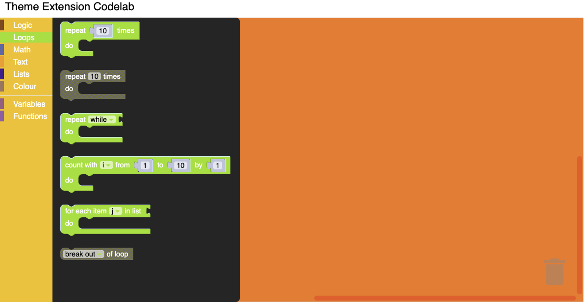
Update the Theme definition to have the block styles as below.
Blockly.Themes.Halloween = Blockly.Theme.defineTheme('halloween', {
  'base': Blockly.Themes.Classic,
  'categoryStyles': {
    'list_category': {
      'colour': "#4a148c"
    },
    'logic_category': {
      'colour': "#8b4513",
    },
    'loop_category': {
      'colour': "#85E21F",
    },
    'text_category': {
      'colour': "#FE9B13",
    },
  },
  'blockStyles': {
    'list_blocks': {
      'colourPrimary': "#4a148c",
      'colourSecondary':"#AD7BE9",
      'colourTertiary':"#CDB6E9",
    },
    'logic_blocks': {
      'colourPrimary': "#8b4513",
      'colourSecondary':"#ff0000",
      'colourTertiary':"#C5EAFF"
    },
    'loop_blocks': {
      'colourPrimary': "#85E21F",
      'colourSecondary':"#ff0000",
      'colourTertiary':"#C5EAFF"
    },
    'text_blocks': {
      'colourPrimary': "#FE9B13",
      'colourSecondary':"#ff0000",
      'colourTertiary':"#C5EAFF"
    },
  },
  'componentStyles': {
    'workspaceBackgroundColour': '#ff7518',
    'toolboxBackgroundColour': '#F9C10E',
    'toolboxForegroundColour': '#fff',
    'flyoutBackgroundColour': '#252526',
    'flyoutForegroundColour': '#ccc',
    'flyoutOpacity': 1,
    'scrollbarColour': '#ff0000',
    'insertionMarkerColour': '#fff',
    'insertionMarkerOpacity': 0.3,
    'scrollbarOpacity': 0.4,
    'cursorColour': '#d0d0d0',
    'blackBackground': '#333'
  }
});
Test it
Click on different blocks in the component and you should see the colours that you applied show up.